Updater Updates Its Own Look & Logo

Today, our ubiquitous postage stamp logo gets a refresh.
The transformation is more than just a logo update, however. It’s a coming-of-age tale. It’s time for our branding to truly represent how our partners view Updater and how we view ourselves.
During our own recent moves, members of our team used Updater. In doing so, we realized that our product has matured beyond our brand image. Our product allows Americans to truly tackle all pieces of a move. However, our logo only represented one tiny fragment of the Updater equation – our mail forwarding feature – and didn’t adequately represent all that is possible with Updater. Months in the making, the goal of our logo refresh is to visually demonstrate our innovation in moving: Updater offers everything you need to get you from Point A to Point B, within one platform.
Moving forward with the Updater brand
A lot has changed at Updater over the last few years and right now – late 2016 – is a monumental time for us. We’re helping hundreds of thousands of Americans move each month. The most innovative companies in the real estate and relocation industries now leverage our technology. Our team is preparing to move to a new office with a rather zealous scaling plan in place (view job openings here). We recently IPO’ed, making us a publicly traded company. Crain’s named Updater one of the “Best Places to Work in NYC” this year, for the first time. We’ve won two American Business Awards for “Most Innovative Tech Company of the Year.” And much more.
With all of these major milestones behind us, it’s time for our brand to evolve and reflect the wonderful reality of Updater today.
So, we’re proud to introduce a new logo that says it all. A logo that more adequately represents Updater – and our mission and goals. It’s bold and assertive, modern and clutter-free, with a nod to our history. You’ll see, we’ve taken the Updater logo (originally designed to represent mail forwarding with a postage twist) and updated it for a product that does so much more. A product that allows you to move from your old home to a new one, seamlessly and all in one place.
When speaking with partners, friends and team members, it became evident that the salute to the postage stamp was unique, but people wanted to see a more literal interpretation of the forward-thinking, innovative company we have become. It was important to keep our vibrant red, but showcase the company’s potential and personality. You’ll find the new logo used in conjunction with our friendly color palette and welcoming imagery that Updater is known for (cue “Party Whale”).
The days ahead
The mission of Updater’s new look: to represent the company’s innovative future while showing that our passion for reimagining moving hasn’t changed a bit.
Our identity is more than a logo, though. Over the next few months, you will begin to notice a new Updater experience, all the way through to the innovative features we’re famous for building.
We’ve taken the best of Updater and transformed it for our next chapter. We hope you like our new look as much as we do!
More Updater Life
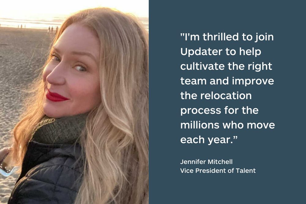
Changes to Updater’s team
16 August 2022
Updater raises $215M to accelerate product, design, data, and engineering
19 May 2022